Do you know how your day looks as a pie chart? Why would I even consider looking at your day this way? Having a view of your day in a graphic way, gives you a totally different view.
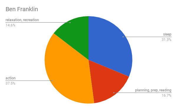
7.5 hours of sleep
3.5 hours of planning, preparation, and reading
9 hours of action
3.5 hours of relaxation and recreation
Yes, I know this does not total to 24 hours, but only 23 hours. The author of the post, pointed this out. So, I worked with what he had.
Now check out his schedule summary as a pie chart:
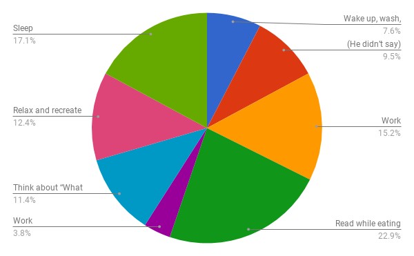
How would his chart look based on the breakdown list of his day the way he recorded it in his autobiography:
4:00 Wake up and wash, breakfast
5:00 (He didn’t say.)
8:00 Work
12:00 Read while eating lunch
2:00 Work
6:00 Think about “What good have I done today?”
6:30 Relax and recreate
9:00 Sleep
Breakdown of his daily schedule list as a pie chart
What do you think? Do you find the list or the pie chart more informative? For me the pie chart gives me much better insights into his daily schedule.
In addition, knowing the percentage of each pie shape allows you to compare them to each other and so gives you a better understanding.
Create a List of Your Own Daily Schedule
Do you want to create your own daily schedule pie chart? First you need a list of your average 24 hour workday.
I suggest you use a spreadsheet. I used Google Sheets with 2 columns. I wrote down the time each activity starts and when it ends. In the 2nd column I wrote what the activity was.
Below is just a rough example. Fine tune it for your personal day.
Start with the time you are going to sleep
Waking up
Your morning routine
Breakfast
Commute to work
Work in the morning
Lunch break
Work in the afternoon
Commute
Supper
After supper activities
Now it’s time to turn the list into a pie chart.
How to Turn the Information into a Pie Chart
If you don’t know how to create your pie chart, follow these steps:
Open your spreadsheet
Select the two columns and all the rows with information you want to turn into a pie chart
Chose Insert and scroll down to Chart
Once the chart pops up select the down arrow under Chart Type and scroll down to the pie chart option.
The result is a pie chart of all the selected activities in your spreadsheet
The chart will then show up in the spreadsheet and you can move it around to place it where you want it or resize it.
Clicking on the 3 dots in the top right corner of the chart, gives you a menu of options. One of them is to save the chart as an image that you can then use anywhere you like.
To reduce the pie shapes, combine all info that belong to the same activity. Copy the info from your spreadsheet and paste it below the current info. In a 3rd column write what each activity is. Now below the hours for each activity in a row and in the column beside the name of the summarized activities. To make sure that the hours add up to 24 hours go to Functions -> SUM and then create another Pie Chart.
Use Your Pie Chart to Improve Your Productivity
Once you have this information, you can use it to improve your productivity as you now can see, where you might be wasting time. This chart lets you decide how your time should be used more productively.
I would love to assist making changes in your productivity
based on your pie chart.
Please contact me today for a discovery consultation.

 What do you think? Do you find the list or the pie chart more informative? For me the pie chart gives me much better insights into his daily schedule.


